
Landing Page CRO: 7 Data-Backed Changes That Lift Conversions
Most landing pages convert under 3%. That means 97 out of every 100 visitors, many of them paid for with real ad spend, leave without taking action.
The frustrating part is that the fixes are rarely mysterious. Across thousands of published A/B tests and large-scale conversion studies, the same handful of changes shows up again and again as the difference between a page that leaks money and one that prints it.
This is not a list of generic tips. Every change below is backed by published research or documented test results, explained with the reasoning behind it, and ordered so the reasoning is clear even before any test is run. No “add testimonials” fluff. No vague advice to “improve your copy.” Just the specific levers that move conversion rates, and how to pull them.
Why Most Landing Pages Fail Before the Visitor Scrolls
A landing page has exactly one job: turn a specific visitor into a specific action. Homepages serve many intents. Landing pages serve one.
The most common failure is a page that tries to do everything. It has a navigation menu leading to twelve other pages. It has three different CTAs competing for attention. Its headline is clever instead of clear. Its form asks for a phone number, company size, and job title before the visitor knows what they get in return.
Each of these is a small leak. Together, they explain the sub-3% conversion rate that industry benchmarks report year after year. Global ecommerce conversion averages sit between 2.5% and 3.5% depending on the study, and landing pages for lead generation often perform worse, not better, because the ask is higher relative to the trust established.
The seven changes below address the leaks in order of where they occur in the visitor’s journey: first impression, form interaction, trust evaluation, device experience, action moment, proof assessment, and message continuity.
Change 1: Fix the Above-the-Fold Anatomy
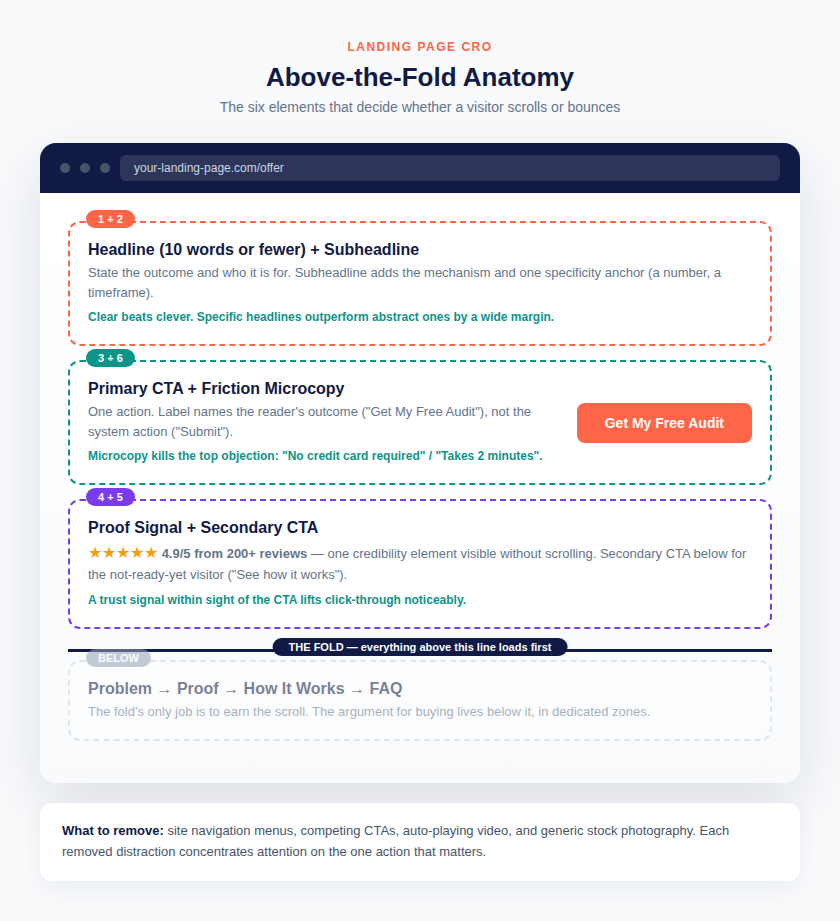
The first viewport, everything visible before scrolling, has one job: make the visitor want to scroll. It does not need to make the full sales argument. It needs to establish three things in under five seconds: what this is, who it is for, and what to do next.
Research into high-converting page structures converges on six elements that belong above the fold:
- Headline, ten words or fewer. A conviction statement: the outcome plus the audience. “Get 3x More Qualified Leads in 90 Days” beats “Transforming Businesses Through Innovative Solutions” every time. Clear, specific headlines consistently outperform clever or abstract ones in published test data, and abstract language depresses conversion measurably against specific alternatives.
- Subheadline. One sentence that expands the headline: the mechanism (how the result is achieved) plus one specificity anchor, a number or a timeframe that makes the claim believable.
- Primary CTA. One action, one label. The label should name the reader’s outcome, not the system’s action. “Get My Free Audit” outperforms “Submit” because it answers the visitor’s question: what do I get when I click?
- Secondary CTA. A lower-commitment option for the not-ready-yet visitor: “See how it works” or “View pricing.” Include it only if the primary CTA asks for meaningful commitment.
- Proof signal. One credibility element visible without scrolling: a recognizable client logo, a specific number, or a third-party rating. Published test summaries report that placing a trust signal within sight of the CTA button lifts click-through by roughly 18 to 22%.
- Friction microcopy. One line that removes the dominant objection to clicking: “No credit card required,” “Takes 2 minutes,” “Cancel anytime.”
Just as important is what to remove. Pages with a single dominant CTA convert better than pages with multiple competing CTAs in published comparisons (13.5% versus 11.9% in one widely cited dataset). Navigation menus are the silent killer: removing the site navigation from a landing page has produced conversion lifts of up to 100% in documented HubSpot tests, because every nav link is an exit path from a page whose only job is conversion.
The six elements of a high-converting first viewport, and what to remove. Custom diagram by SCORSH.
Change 2: Cut Form Friction Ruthlessly
The form is where interest converts into action, and it is also where most landing pages hemorrhage conversions. Every field is a small tax on the visitor’s motivation. The research on this is unusually consistent.
HubSpot’s frequently cited analysis found that reducing form fields from four to three increased conversion rates by nearly 50%. An ecommerce case study documented a 30% conversion increase from cutting checkout fields from fifteen to ten. Baymard Institute’s checkout research puts the average at 14.88 fields against an ideal of just 8, meaning most forms carry nearly twice the fields they should.
The mechanism is straightforward: each additional field increases perceived effort and, for sensitive fields, perceived risk. The visitor performs a subconscious cost-benefit calculation, and every field tips the scale toward abandonment.
Four specific tactics, in order of impact:
Remove ruthlessly. Audit every field against one question: is this required to deliver what was promised? “Company size” and “job title” on a free audit form are nice-to-have data for sales, but they are conversion killers for marketing. Collect the minimum to start the conversation, then enrich later.
Split into steps when fields are unavoidable. When the information is genuinely needed, multi-step forms with progressive disclosure outperform single long forms dramatically. Published data shows progressive multi-step forms converting at 5.64% against 3.07% for single-step equivalents, an 84% uplift. The psychology: three short steps feel easier than one long form, even with identical total fields, and each completed step creates commitment momentum.
Validate inline, not on submit. A travel booking case study documented a 22% decrease in form abandonment after introducing inline validation. Telling the visitor about an error the moment it happens, next to the field, beats a red error summary after they hit submit. The submit-time error feels like punishment. Inline validation feels like help.
Enable autofill and smart defaults. Browser autofill support and input autocomplete measurably reduce completion time, especially on mobile where typing is painful. One retail case study reported a 25% improvement in completion times from autofill alone. Set the right input types (email, tel, number) so mobile devices show the right keyboards.
The principle underneath all four: the form should feel like less work than the visitor expected, not more.
One more consideration that rarely gets attention: field types matter as much as field counts. A phone number field costs more conversions than a name field, because it carries higher perceived risk (sales calls) and higher input effort on mobile. Dropdowns for information the visitor must look up (“How did you hear about us?”) create more friction than radio buttons for information they already know. When prioritizing which fields to cut, remove high-risk fields first: phone numbers, budgets, and anything that feels like qualifying interrogation rather than helpful intake. If sales genuinely needs the phone number, ask for it on step two of a multi-step form, after the visitor has already invested effort in step one. Sunk cost works in the marketer’s favor here: abandonment drops once the visitor has completed a first step.
Change 3: Use Trust Signals That Actually Move the Needle
“Trust signals” has become generic advice, which is why most implementations fail. A row of stock-photo badges saying “Secure” and “Trusted” moves nothing. The trust signals that work share one trait: specificity.
Generic claims are invisible. Specific claims are believable. Compare:
- Weak: “Trusted by thousands of businesses”
- Strong: “4.9/5 from 212 verified Google reviews”
The first could describe anyone. The second contains three verifiable facts: a rating, a count, and a platform. Specificity is what separates a trust signal from decoration.
Four categories of trust signal, ranked by typical impact:
1. Third-party ratings with real numbers. Star ratings from Google, Clutch, G2, or Trustpilot, shown with the actual score and review count. These work because the visitor knows the business cannot fully control them.
2. Named client logos. Recognizable names beat anonymous claims. Six real logos outperform a paragraph of adjectives. Where client names cannot be shared, industry descriptors (“A national dental chain, 40 locations”) beat nothing, but named beats unnamed.
3. Risk reversal near the CTA. Guarantees, free trials, “cancel anytime,” and “no credit card required” are trust signals disguised as offer terms. They work by shrinking the perceived downside of acting now. Place the single most relevant one as microcopy directly under the primary CTA, not buried in the footer.
4. Real faces, real quotes. A testimonial with a name, photo, company, and specific result (“Cut our cost per lead from Rs 1,800 to Rs 640 in 60 days”) outperforms five anonymous praise quotes. Video testimonials outperform text, but only when they are genuine customers speaking naturally, not scripted reads.
What does not work: security badges on pages that collect no sensitive data, “SSL secure” labels the visitor already assumes, award badges from organizations nobody recognizes, and counters showing unimpressive numbers (“Serving 12 happy clients” invites the question of why so few).
The test for any trust signal: if a competitor could paste the identical badge on their page without changing a word, it is not a trust signal. It is decoration.
Change 4: Design Mobile-First, Not Mobile-Also
Mobile drives roughly 60% of global web traffic and a similar share of ecommerce sales, yet mobile conversion rates lag desktop badly. Published benchmarks put desktop conversion around 3.9% against mobile at roughly 1.8%, even though mobile accounts for the majority of visits. That gap is not a device limitation. It is a design failure.
Most landing pages are still designed on desktop and “adapted” for mobile. The result: tiny tap targets, forms that require pinch-zooming, CTAs below three screens of content, and load times that test visitor patience past breaking point.
The mobile CRO checklist, in priority order:
Speed is the headline act. Google’s research found 53% of mobile visitors abandon a page that takes longer than three seconds to load. Portent’s analysis of 24 million page views found conversion rates of 3.05% at one-second load times collapsing to 0.41% at five seconds. Shopify’s 2026 platform-wide study quantified it further: every 100 milliseconds of slower Largest Contentful Paint correlated with roughly 3.5% lower conversion, and stores at 2.5-second LCP converted about 30% worse than stores at 1.5 seconds. On mobile, speed is not a technical nicety. It is the conversion rate.
Thumb zones dictate layout. On phones, the comfortable tap area is the bottom two-thirds of the screen, centered horizontally. The primary CTA should live there, not at the top. Sticky mobile CTAs that follow the scroll consistently outperform static ones buried in the layout.
Tap targets must be forgiving. Minimum 44×44 pixels, with generous spacing between adjacent tappable elements. Nothing kills mobile conversion like tapping “Buy Now” and hitting “Cancel” because the buttons are 8 pixels apart.
Forms must be thumb-typable. Fewer fields (see Change 2), correct input types triggering the right keyboards (numeric for phone, email keyboard for email), and autofill support. Every unnecessary keystroke on mobile costs more than the same keystroke on desktop.
Kill the hamburger-only navigation. On a landing page there should be no navigation at all (see Change 1), but if the page template forces one, ensure the CTA remains visible without opening a menu.
For businesses where the audience skews heavily mobile, and in markets like India where mobile-first browsing exceeds 80%, designing desktop-first is designing for the minority of visitors. Start with the 375-pixel-wide canvas. Expand outward, not the reverse.
Change 5: Rewrite the CTA (Copy and Placement)
The call to action is the highest-leverage text on the page. It is also where the laziest copy lives: “Submit,” “Click Here,” “Learn More.” These labels describe the mechanics of clicking, not the value of acting.
The data-backed rules for CTA copy:
Name the outcome, not the action. “Get My Free Growth Audit” tells the visitor what they receive. “Submit” tells them what the button does mechanically. The first converts better because it completes the value sentence started by the headline.
Use first-person possessive where natural. Testing across the industry has repeatedly favored “Get My Free Trial” over “Get Your Free Trial” and “Start My Free Trial” over “Start Your Free Trial.” The mechanism: “my” creates psychological ownership before the click. The effect is modest per test but consistent in direction.
Keep it short but specific. Two to five words. “Get a Free Quote” beats “Click here to get a free quote for your project today.” Brevity respects the scanning eye; specificity respects the skeptical mind.
Match the commitment to the funnel stage. A cold-traffic visitor will not “Buy Now.” They might “See Pricing” or “Watch the 2-Minute Demo.” CTA commitment should step up gradually: low-commitment CTAs above the fold for cold traffic, higher-commitment CTAs after proof sections for warmed visitors.
Placement rules matter as much as copy:
Above the fold, always. The primary CTA must be visible without scrolling. No exceptions.
After every major proof block. Testimonials, case studies, guarantee sections: each is a moment of peak persuasion, and each should be followed by the CTA while motivation is high. A long page with one CTA at the bottom wastes every persuasion peak in between.
Sticky on mobile. As covered in Change 4, a persistent mobile CTA bar captures the visitors who would otherwise scroll past every static button.
One primary CTA per viewport. Secondary actions (“Watch demo,” “Read case study”) should be visually subordinate: text links or ghost buttons, never competing solid buttons of equal weight.
A useful audit: screenshot the page, blur everything except the buttons, and check whether the eye still finds exactly one dominant action per screen. If two buttons compete, one of them is costing conversions.
It is worth noting what the research says about the most over-tested CTA variable: button color. Color tests are popular because they are easy to run, but they consistently produce the smallest gains in published test roundups. The hierarchy of CTA leverage runs: offer and copy first, placement second, surrounding friction (microcopy, nearby proof) third, and visual styling a distant fourth. Teams that start with color are optimizing the least important variable. Teams that start with the offer, asking whether the CTA promises something the visitor actually wants, find the gains that matter. A perfectly styled button promoting a weak offer will always lose to a plain button promoting an irresistible one.
Change 6: Make Social Proof Specific
Change 3 covered trust signals near the CTA. This change is about the dedicated social proof section further down the page, where most implementations go wrong by optimizing for volume instead of specificity.
Ten vague testimonials lose to two specific ones. The reason is credibility economics: visitors discount praise automatically, and the discount rate rises with vagueness. “Great service, highly recommended!” gets discounted to zero because it contains no verifiable content. “They rebuilt our landing pages in three weeks. Cost per lead dropped 41% in the first month, measured in our own analytics” survives the discount because it makes claims specific enough to check.
The anatomy of high-converting social proof:
Name, face, company. Anonymous testimonials (“Founder, D2C Brand”) read as fabricated, and in an era of AI-generated content, visitors are increasingly primed to suspect them. Real names with real photos and real companies are non-negotiable for the primary testimonials.
Specific numbers, not adjectives. “Doubled our revenue” is better than “amazing results.” “From Rs 4.2L to Rs 8.9L monthly revenue in five months” is better still. Numbers are the difference between praise and evidence.
Relevance matching. A testimonial from a business like the visitor’s converts better than a more impressive testimonial from an unrelated industry. A dentist reading a dentist’s story thinks “that could be me.” A dentist reading a SaaS company’s story thinks “different business.” Match proof to audience wherever the page targets a specific vertical.
Problem-solution-result structure. The most persuasive testimonials follow a three-beat arc: the situation before (“We were spending Rs 2L/month on ads with nothing to show”), the intervention (“They rebuilt our funnel and creative testing process”), the measured result (“Cost per qualified lead fell 58% in 90 days”). This structure works because it mirrors the visitor’s own hoped-for journey.
Quantity as a secondary layer. Once two or three deep, specific testimonials establish credibility, aggregate numbers add scale: total reviews, average rating, clients served. But aggregates never substitute for specifics. “4.8/5 from 300+ reviews” supports; it does not lead.
One more consideration: place the strongest proof immediately after the problem section, not buried near the footer. The visitor’s skepticism peaks right after they recognize their problem in the copy. That is the moment proof is most persuasive.
Change 7: Enforce Post-Click Congruence
This is the highest-ROI change most advertisers ignore. Post-click congruence means the landing page continues the exact conversation the ad started: same headline promise, same offer, same language, same visual identity.
When a visitor clicks an ad reading “Free SEO Audit for Dentists” and lands on a page headlined “Digital Marketing Services,” a mismatch alarm fires. The visitor wonders if they clicked the wrong link. Trust drops. Bounce rates rise.
Documented tests put numbers on this. Matching the ad headline to the page H1 lifted conversion 66% in one published test and over 200% in another, with cost per lead falling nearly 70% in the stronger case. The mechanism is relevance: the visitor’s brain is pattern-matching, and every matched element (“yes, this is what I clicked for”) lowers cognitive friction.
The congruence checklist:
Headline match. The page H1 should mirror the ad headline’s promise, ideally word-for-word on the core phrase. If the ad says “Plumber Google Ads That Actually Ring,” the page should not say “Welcome to Our Marketing Agency.”
Offer match. If the ad promises a free audit, the page’s CTA must offer the free audit, not a “contact us” form or a newsletter signup. Bait-and-switch, even unintentional, destroys conversion.
Visual match. Same color palette, same imagery style, same branding. The page should feel like the ad’s natural continuation, not a different company’s website.
Keyword match for search traffic. For Google Ads traffic, the search term, ad copy, and landing page should form an unbroken chain of relevance. This is also half of Google’s landing page experience rating, which directly affects Quality Score and cost per click. Above-average landing page experience combined with strong ad relevance is associated with meaningfully lower CPCs.
One ad group, one page. The structural discipline behind congruence: resist sending multiple ad groups with different promises to a single generic page. The page exists to continue one specific conversation. Build the page per message, not per account.
For teams running paid traffic, auditing congruence is the single fastest diagnostic available. Pull the top five ad groups by spend, open each destination page, and score the headline, offer, and visual match out of ten. Anything below eight is leaking money.
How to Prioritize: The Impact vs Effort Matrix
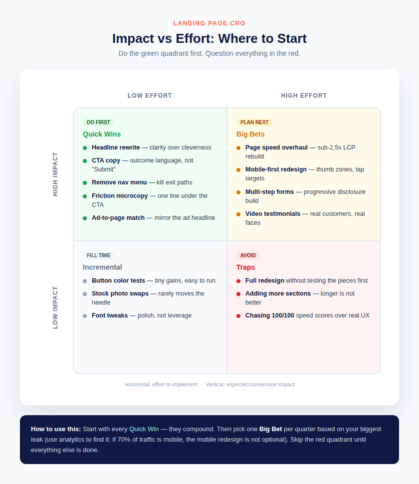
Seven changes is a roadmap, not a weekend. The right order depends on effort and expected impact, and on where the specific page leaks most.
Prioritization matrix for the seven changes. Start green, plan yellow, question red. Custom diagram by SCORSH.
Do first (high impact, low effort): headline rewrite, CTA copy, navigation removal, friction microcopy, ad-to-page headline match. These are copy and configuration changes. Most can ship in a day. Their compounding effect is disproportionate because they fix the first impression, which gates everything below.
Plan next (high impact, high effort): page speed overhaul, mobile-first redesign, multi-step form builds, genuine video testimonials. Pick one per quarter, chosen by the biggest leak in the analytics. If 70% of traffic is mobile and mobile converts at half the desktop rate, the mobile redesign is not a nice-to-have. It is the business case.
Fill time (low impact, low effort): button color tests, stock photo swaps, font tweaks. Fine as ongoing optimization once the big levers are pulled. Never the starting point.
Avoid (low impact, high effort): full redesigns without testing the pieces first, adding more sections on the theory that longer is better, chasing perfect speed scores at the expense of real user experience. These consume quarters and teach nothing.
The meta-principle: test the highest-leverage hypothesis first, learn from it, and let each result inform the next test. CRO is not a project with an end date. It is a system for compounding small, verified wins into a conversion rate the competition cannot match because they never built the testing habit.
There is a final trap worth naming: the redesign reflex. When conversion rates disappoint, the instinct is to rebuild the entire page. This feels productive and looks impressive in a portfolio, but it destroys learning. A full redesign changes dozens of variables at once, so when conversion moves, up or down, nobody knows why. The disciplined alternative is sequential testing: change the headline, measure, then change the form, measure, then change the proof placement, measure. Slower in week one. Infinitely more valuable by month three, because every result compounds into institutional knowledge about what the specific audience responds to. The teams with the highest conversion rates are not the teams with the prettiest pages. They are the teams with the longest list of tested hypotheses.
The One-Page Audit
To close, here is the fastest diagnostic in this entire playbook. Open the landing page and answer seven questions:
- Can a stranger state what the page offers, for whom, in under five seconds?
- Is there exactly one dominant CTA above the fold?
- Does the form ask for anything not strictly required to deliver the promise?
- Is there a specific, verifiable trust signal within sight of the CTA?
- Does the page load in under three seconds on a mid-range phone?
- Does the H1 mirror the headline of the ad or link that sends the most traffic?
- Could a competitor paste the testimonials onto their own page without changing a word? (If yes, they are not proof.)
Every “no” is a leak with a known fix above. Start with the cheapest “no” and work upward. That is the entire playbook: find the leaks in order, fix them with evidence, and measure everything.
—
SCORSH builds high-converting landing pages as part of its performance marketing services. The agency’s paid media and landing page programs run creative and conversion testing as one connected system, measured against revenue.